F.O.G. Architecture-Birdie Cup Coffee
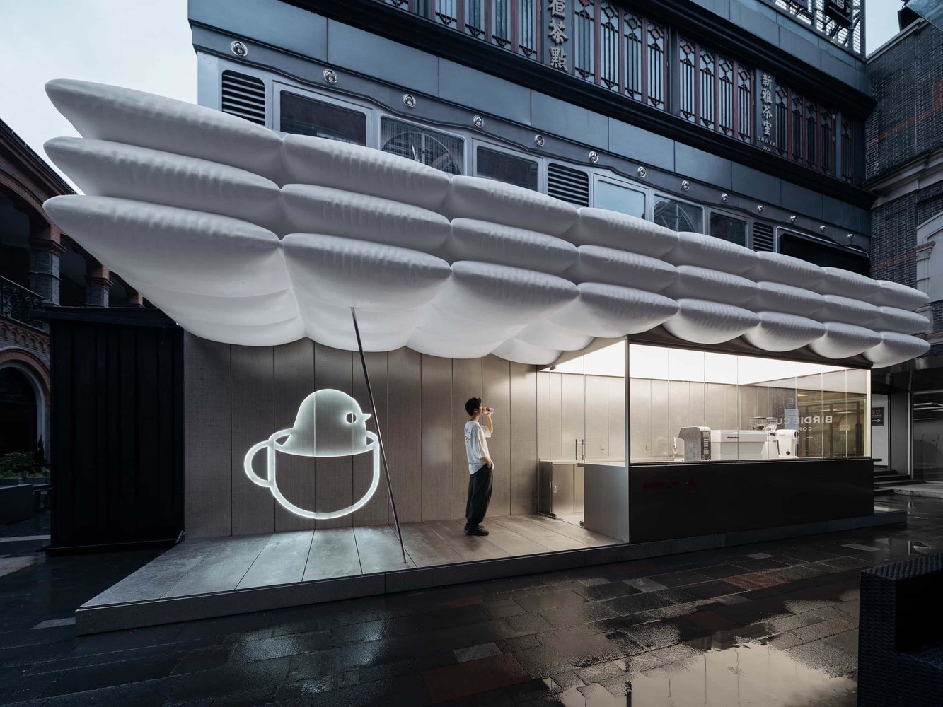
상하이의 위치한 25제곱미터 규모의 이 카페는 빽빽하게 밀집된 스쿠멘 건물과 상업 공간 사이에 있다. de-architecture 방법을 사용하여 유리와 무광 마감 금속을 넓게 적용하여 흰색과 회색의 투명하고 확장된 공간을 만들었다. 곡선형 지붕과 따뜻한 조명은 차갑고 엄격한 이미지를 조절하여 경험과 부드러움을 결합한다. 지붕을 단순한 간판이 아니라 브랜드의 전반적인 비전으로 활용하였다. 지붕은 구조적 미학을 확립하고 상점의 금속 공간을 완화시켰다.
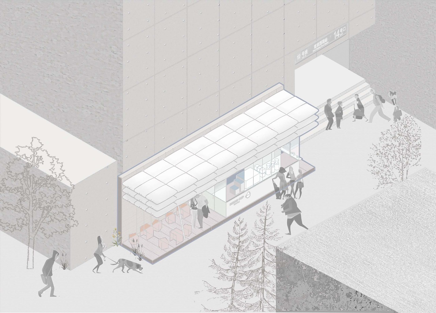
Located in Fengshengli, West Nanjing Road, Shanghai, this 25-square-meter coffee shop finds itself among tightly packed Shikumen buildings and commercial spaces. Situated right next to the metro station, it is in proximity to incessant traffic and pedestrian flow. To build a pacifying “emotional landmark” within the bustling scene became our first lead.
Emotional Landmark. Using the method of “de-architecture,” we applied large areas of glass and matte-finish metal to create an outstretched and transparent space of white and grey. Meanwhile, the curved roof and the warm lighting moderates the cold, stringent imagery, coupling rigidity with softness.
Roof, roof, roof. Roof has always been a keyspace element in our designs. In this particular case, rather than the roof being a mere signage board, we want the roof to establish a sort of structural aesthetics as the overall vision of the brand, which formalises the shop into some “white floating puffs” alleviating the metal space as a soft shelter for a short stay.
Clouds, pillows, balloons, or spaceships – we avoid associating the roof with anyone's imagery, thereby encouraging people to imagine their own spontaneous connections to the space. Like how coffee gets rid of fatigue, we want these floaters to help people zone out a bit. Among other possibilities, the cloud imagery forms a discourse with “birdie” in the brand name and insinuates the Internet age, in which everything is relocated to the cloud and life becomes intertwined with digits.
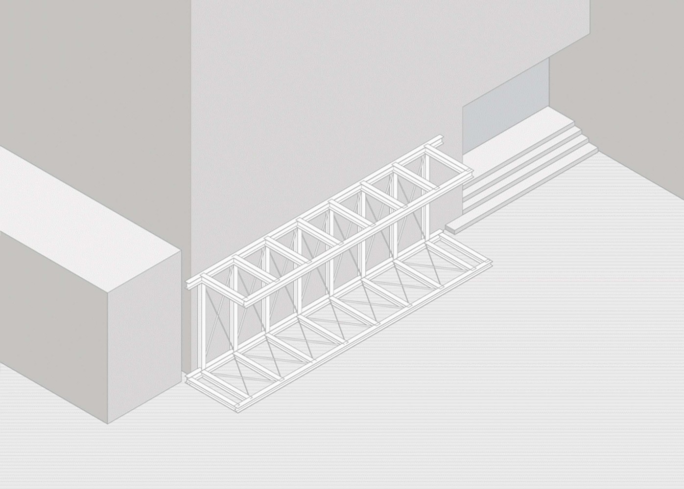
Working collaboratively with the engineering and construction team, we ended up using a C-shaped structure to support the entire roof so that we could keep only one ultra-thin column, preserving the sense of floating.
A Coffee Stop. We worked with a limited palette and purposely lowered saturation to emphasize the free design of windows and facades, which serves to dissolve the barrier between customers and baristas. Finally, the oblique thin pillar adds a layer of dynamism to the space.
From the overall framework to detailed expression, we pursue a balance of order and creativity, of industrial and temper. We hope this micro commercial architecture may fulfill its potential to calm sensation, spur the imagination, and slow down the hustle.
Photography by InSpace


from archdaily
'Commerce' 카테고리의 다른 글
| -무신사 스탠다드 스토어 [ LABOTORY ] Musinsa Standard Store (0) | 2022.01.27 |
|---|---|
| -암석을 기둥처럼 활용한 카페 [ B.L.U.E Architecture Studio ] Zolaism Cafe (0) | 2022.01.23 |
| -갤러리아 광교 [ OMA ] Galleria in Gwanggyo (0) | 2021.12.30 |
| -준지 플래그십 스토어 [ WGNB ] Juun.J Flagship Store (0) | 2021.12.28 |
| -커먼그라운드 [ URBANTINER ] Common Ground (0) | 2021.12.18 |
