

Liso Architects-Basics Office Building
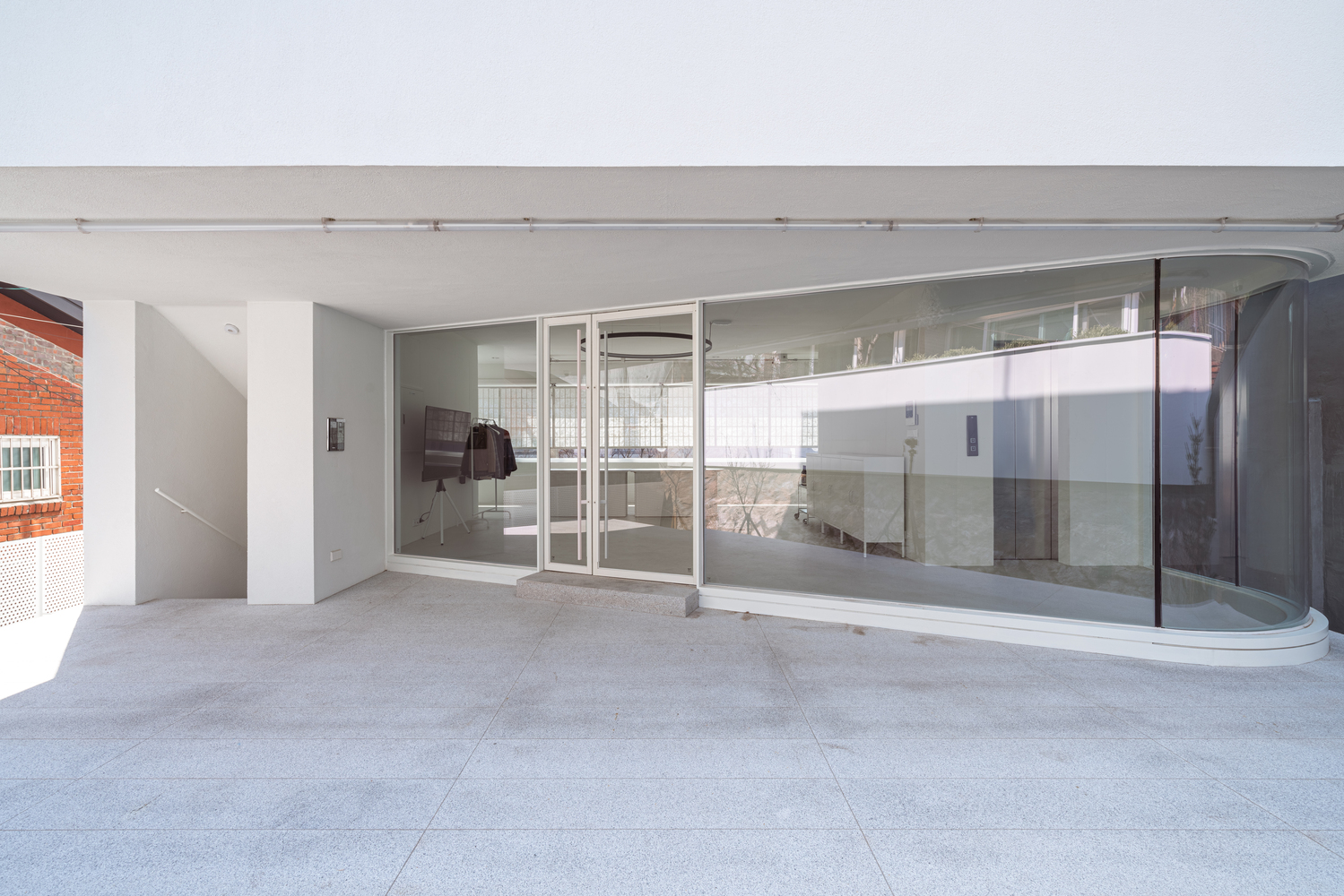
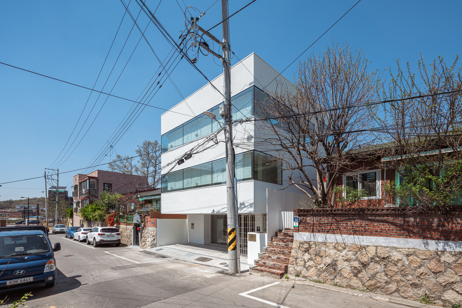
이 업무시설은 대한민국 고양시에 위치하고 있다. 건축가는 차단, 벽 개방 등의 간단한 방법을 사용하여 컨텍스트, 건축형태 및 구성, 정면의 감정적 표현, 실내 공간 등을 표현하였다. 전면 파사드는 한지 차양과 금속 스크린을 사용하여 흰색을 다른 방식으로 표현하는 밝음과 가벼움과 관련이 있다. 입구에 독특한 풍미를 더하기 위해 건축가는 서로 위아래로 엮인 스테인레스 스틸 와이어로 만든 금속 스크린을 사용했다. 공예의 이 두가지 요소는 회사 자체를 표현하고자 하는 욕구를 충족시킬 뿐만 아니라 전면의 딱딱한 인상을 부드럽게 하려고 했다. 건물의 수직적 요소는 내부 벽에 배치했다. 외벽은 내하중 내벽 덕분에 주변 상황을 반영하는 건축 형태의 어휘로 자유롭게 사용된다.
Office Building. On the one hand, office buildings are expected to create comfortable and personal workspaces, on the other hand, to represent the company’s identity. We thought we could use a series of walls, everyday objects that we face and surround us, as the essential element for the design of the office building. We have created a response to the context, architecture form and construction, the emotional expression of the facade, and sensation within the space by using simple methods such as building, hanging, blocking, and opening walls.
Site. Standard one-story houses are lined up on the ground upon which the stone embankment is placed. The site is located at the front of the line where houses stand stepping down the slopes like stairs. The Village of Love, a rural housing complex that started out as housing for government employees about 50 years ago, is architecturally impressive for its vertically repeated landscape scene following the slope of a hill with the horizontal line connecting the embankment, fences, roof planes. But we had no other choice but to remove the horizontal line to secure the necessary car parking spaces.
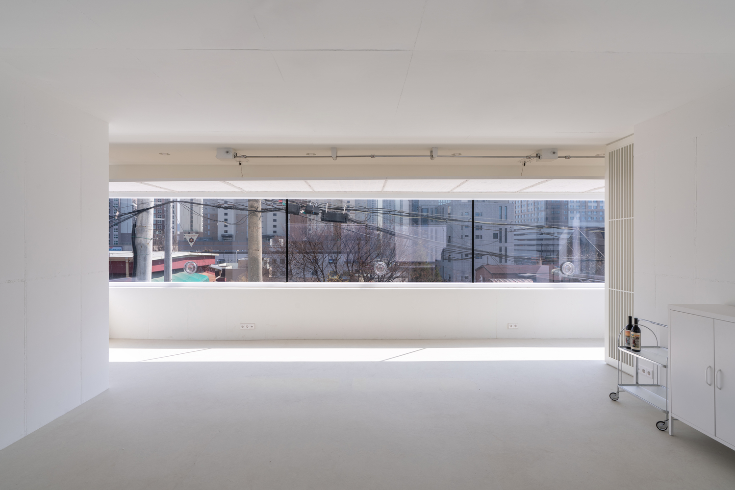
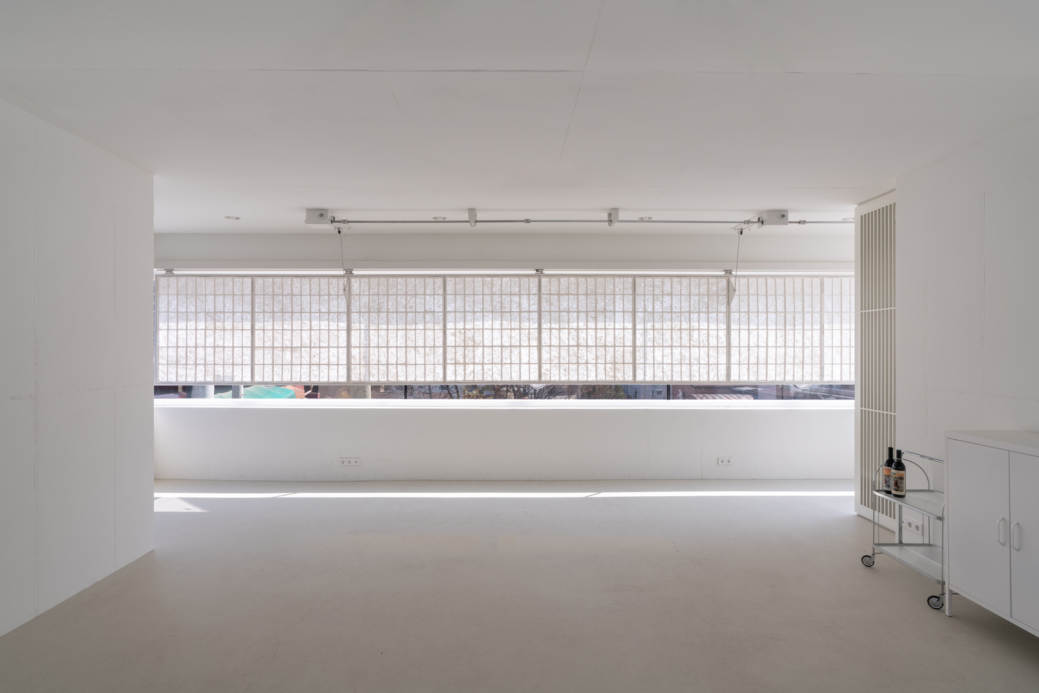
Wall 1. The exterior walls act as a fence placed between the company’s workplace and its neighbor’s living space to provide both with privacy. In consideration of the floor-level difference and distance between the office and the neighborhood, the wall blocks unwanted views while allowing the view from above. The fences come together to form each facade elevation and furthermore the shape of the building. But the front facade of the house was created by rigidly repeating the horizontal lines of the fence, not the result of responding to the surroundings.
Wall 2. The frontal facade, with Korean Hanji paper shades and metal screens, is meant to relate to the brightness and lightness, a different way of expressing the color white. White is Basics’ favorite color. Hanji shades are comprised of drives and 1m x 1.3m molded panels made with Mulberry wood fibers. In order to add a unique flavor to the entrance, we have used metal screens made of twisted stainless-steel wires woven over and under each other. Not only do these two elements of craft satisfy the company’s desire to describe itself, but also seek to soften the rigid impression of the front.
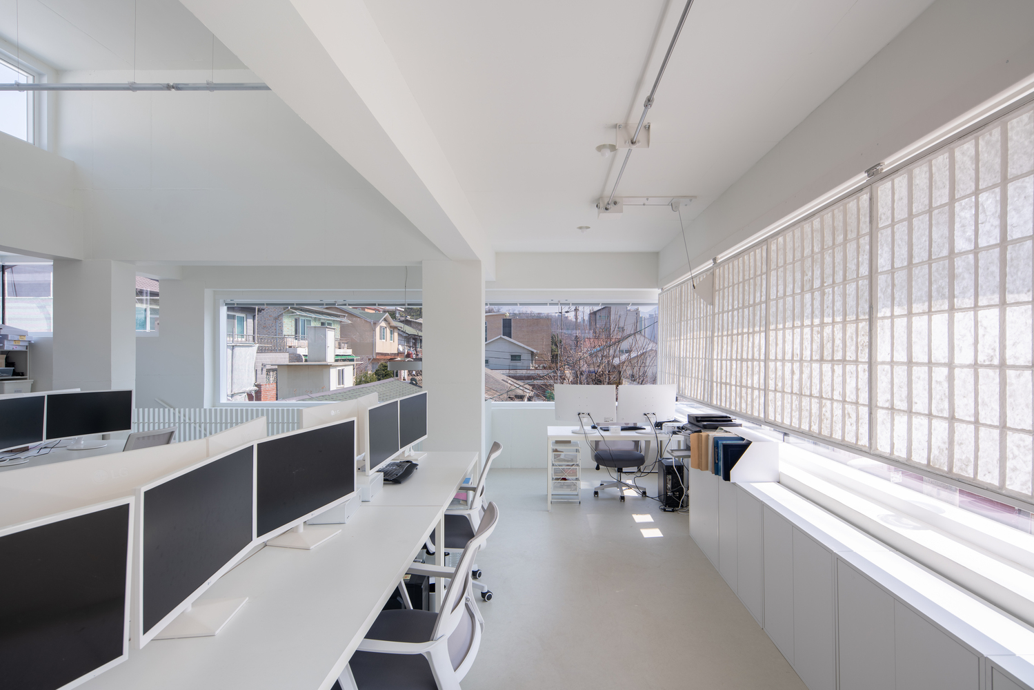
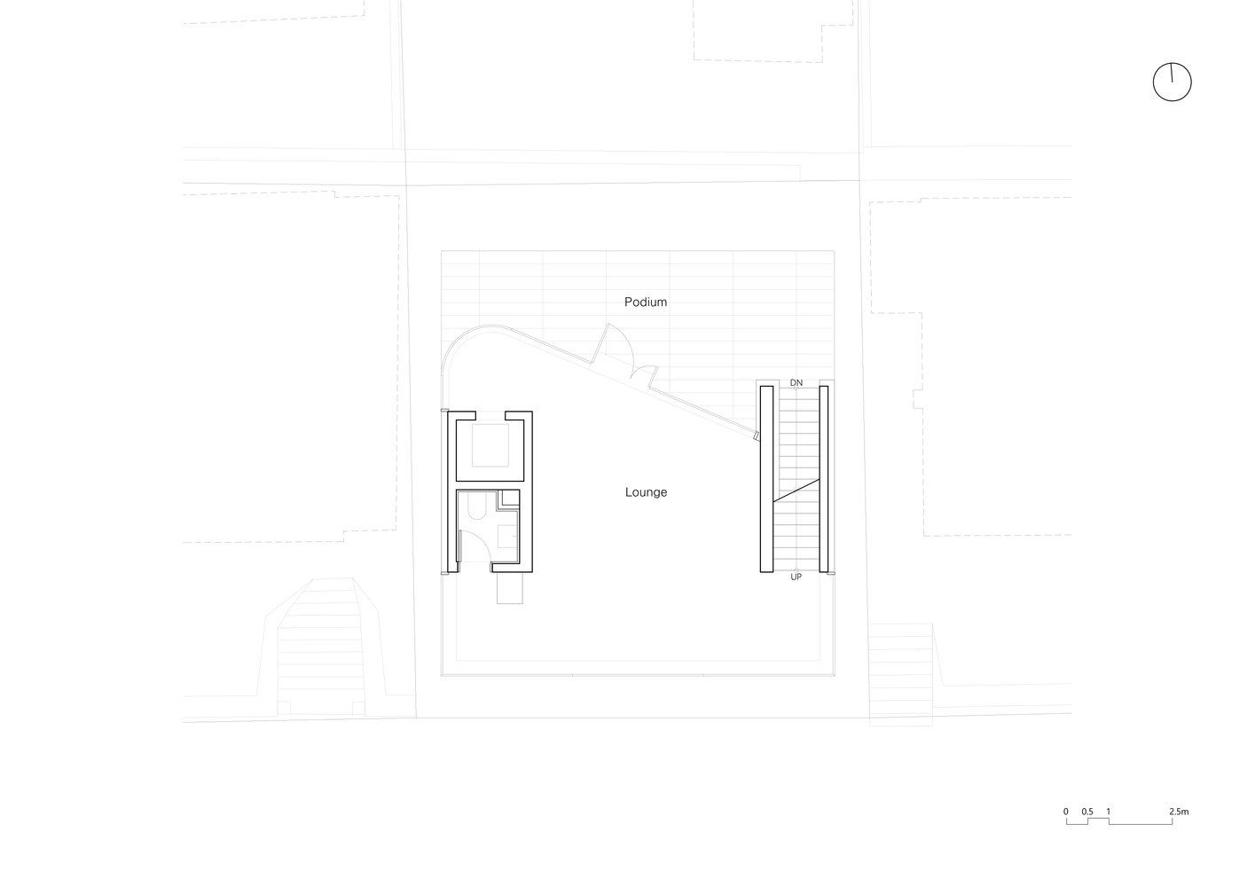
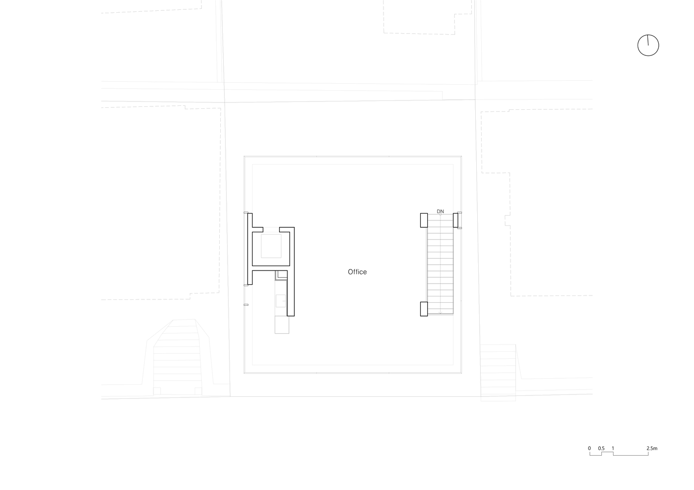
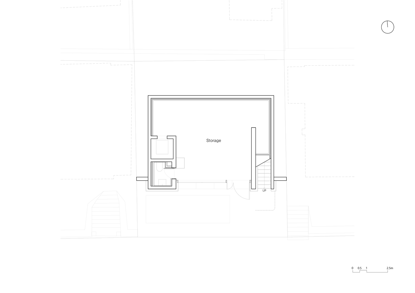
Wall 3. We have placed vertical elements of the building onto the interior wall. The west side wall defines the toilet and elevator core while the east side wall defines stairs. This separation creates working space between the walls. The exterior walls are freely used as a vocabulary of architectural form reflecting the surrounding context by virtue of the load-bearing interior walls. You can find the exposed interior walls at the entry of the house facing a road, a garden with steps, and the top-level rooftop. The interior walls dominate space and structure, whilst allowing the creation of the house.
Photography by Yousub Song


from archdaily
'Office' 카테고리의 다른 글
| -한국 테크노플렉스 [ Foster + Partners ] Hankook Technoplex (0) | 2022.11.15 |
|---|---|
| -이시가키 시청 [ Kengo Kuma & Associates ] Ishigaki City Hall (0) | 2022.11.15 |
| -구글 베이 뷰 [ BIG+Heatherwick Studio ] Google Bay View (0) | 2022.07.19 |
| -도미노 오피스 [ Atelier Ronan Prineau ] Le DomiNO Head Office, Co-Working & Shops (0) | 2022.07.13 |
| -파리지앵 메이슨 오피스 빌딩 [ DESALEUX & SOARES ] Les Maçons Parisiens Office Building (0) | 2022.07.01 |