moss.-Kuwasawa Design School
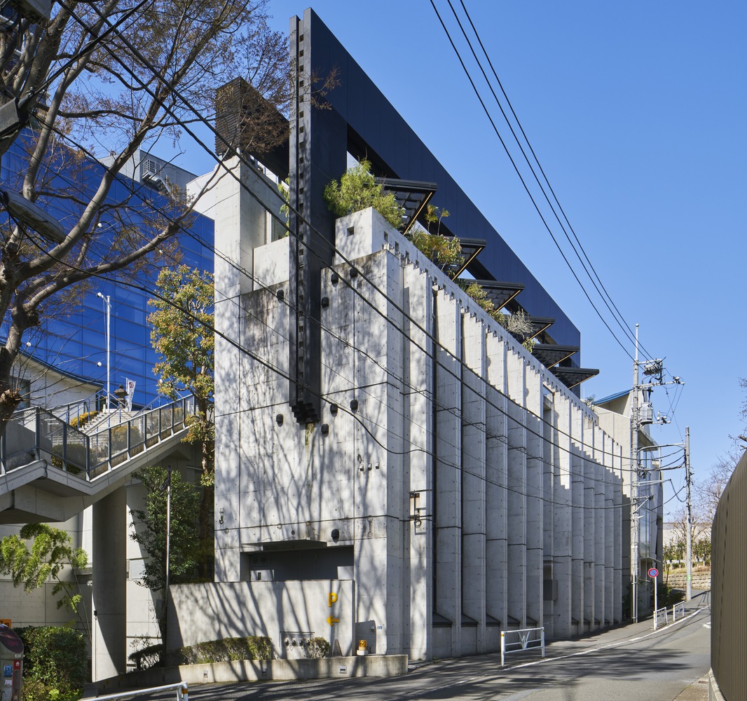
이 건물은 일본 최초의 디자인 전문 학교인 쿠와사와 디자인 학교 건물의 첫 번째 건축 프로젝트이다. 이 건물은 1990년대에 지어진 우체국 건물이다. 건물의 길고 대칭적인 형태를 배치계획에 활용 하였으며, 시설물을 보편적으로 사용할 수 있도록 리뉴얼하고 효율적인 동선을 계획하여 열린 시설물을 만드는 것을 목표로 했다. 그리고 공간은 학생들이 일상적으로 사용하는 손과 눈의 직접적인 접촉을 통해 영감을 불러일으키도록 의도되었다. 스켈레톤에 칠해진 흰색 상자에 사용된 뉴트럴 그레이는 다소 도시적이지만 동시에 온건하고 디자인을 추구하는 학생들의 개성을 강조하기 위해서 사용되었다.
A place for future creators to explore design and nurture the design of the future. The first phase of construction of the new Kuwasawa Design School building, the first design school in Japan. The project began with the complete renovation of a building located not far from the current school building, with the aim of enhancing its functions by operating it in tandem with the current school building.
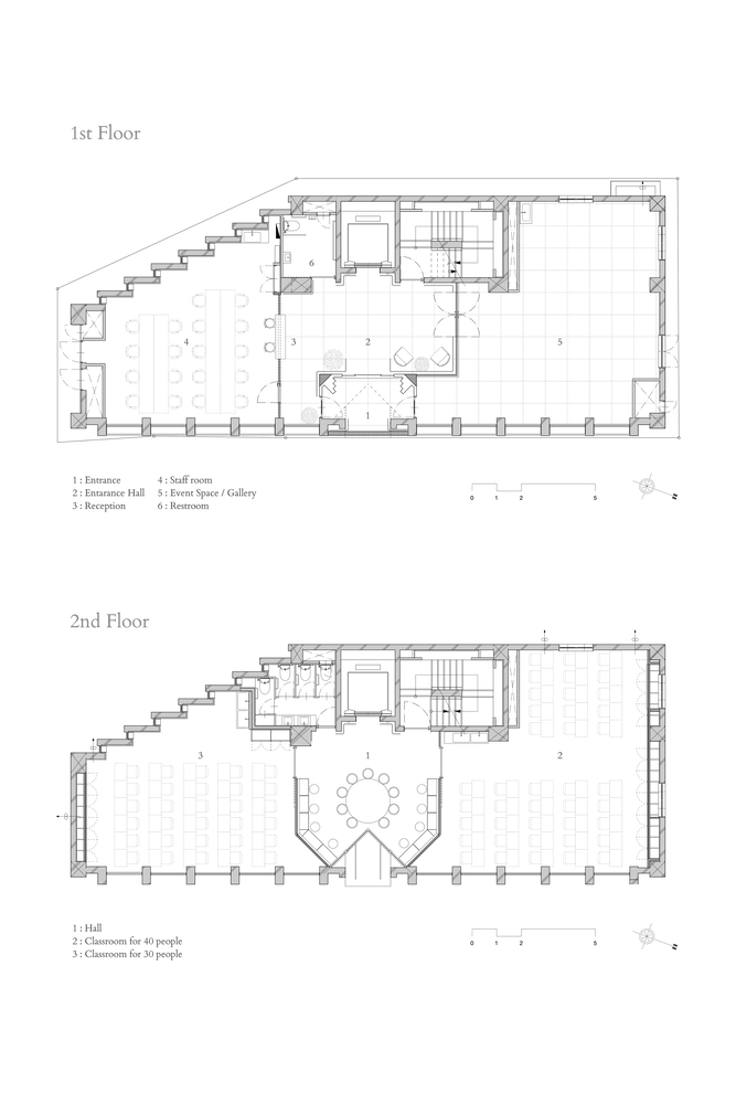
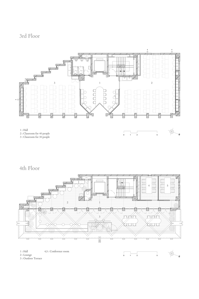
The first phase of the project covered the first to fourth floors above ground, The long, symmetrical shape of the building was utilized in the layout plan, and the aim was to create an open facility by renewing the facilities for universal use and planning efficient flow lines.
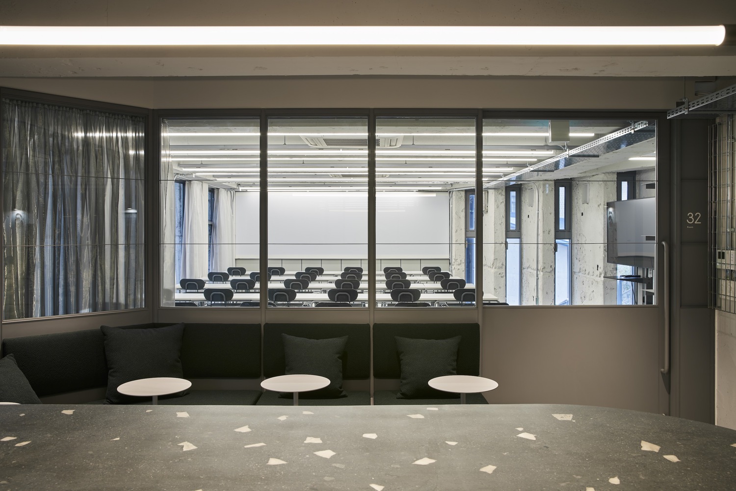
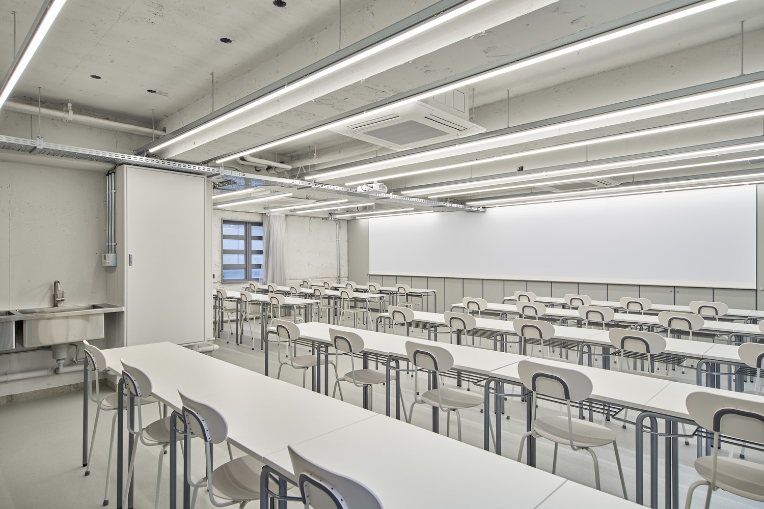
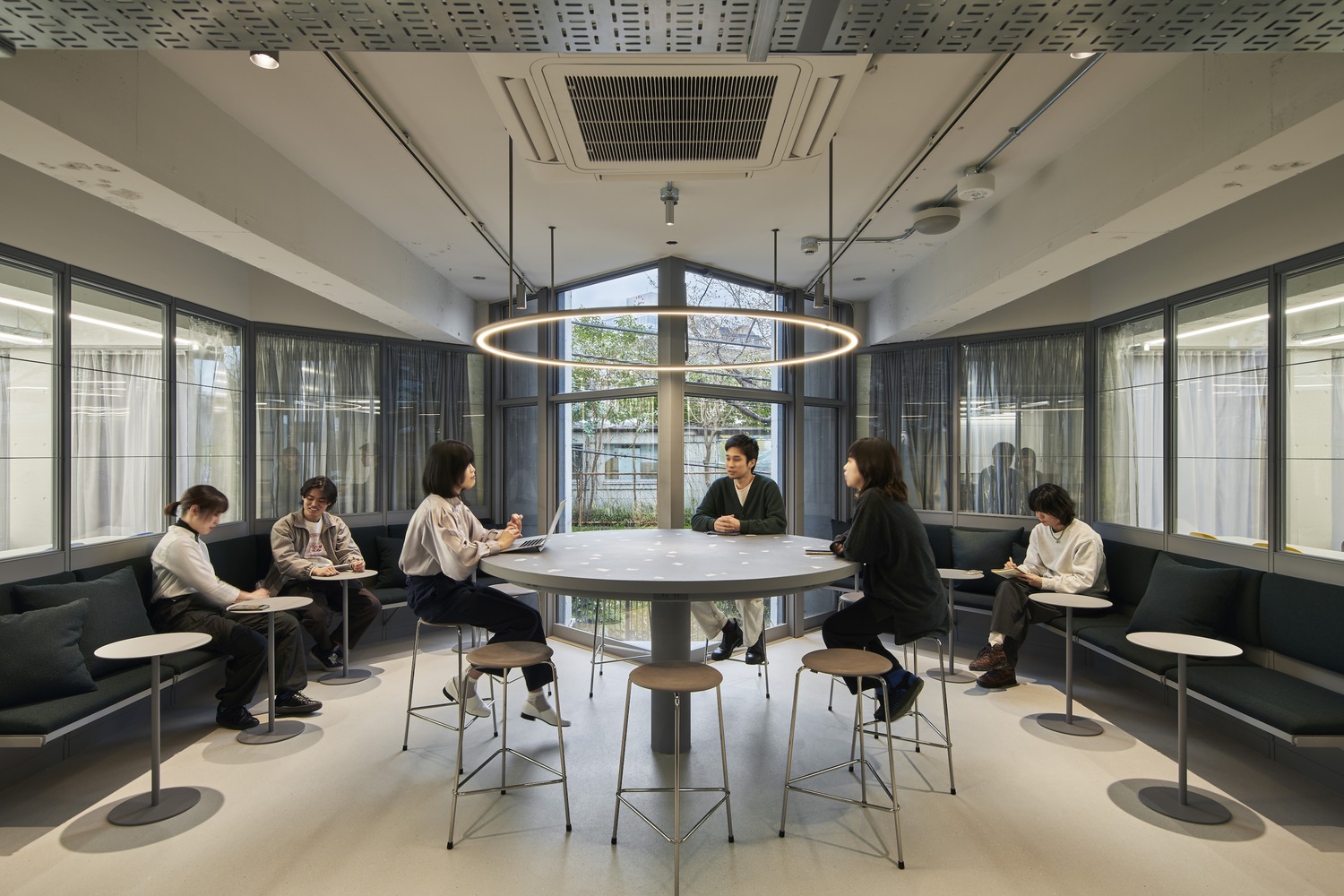
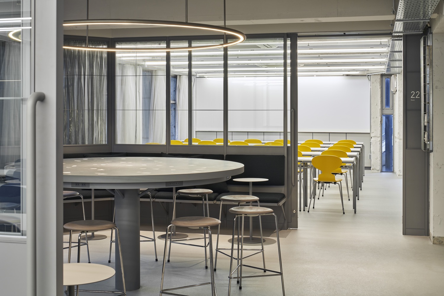
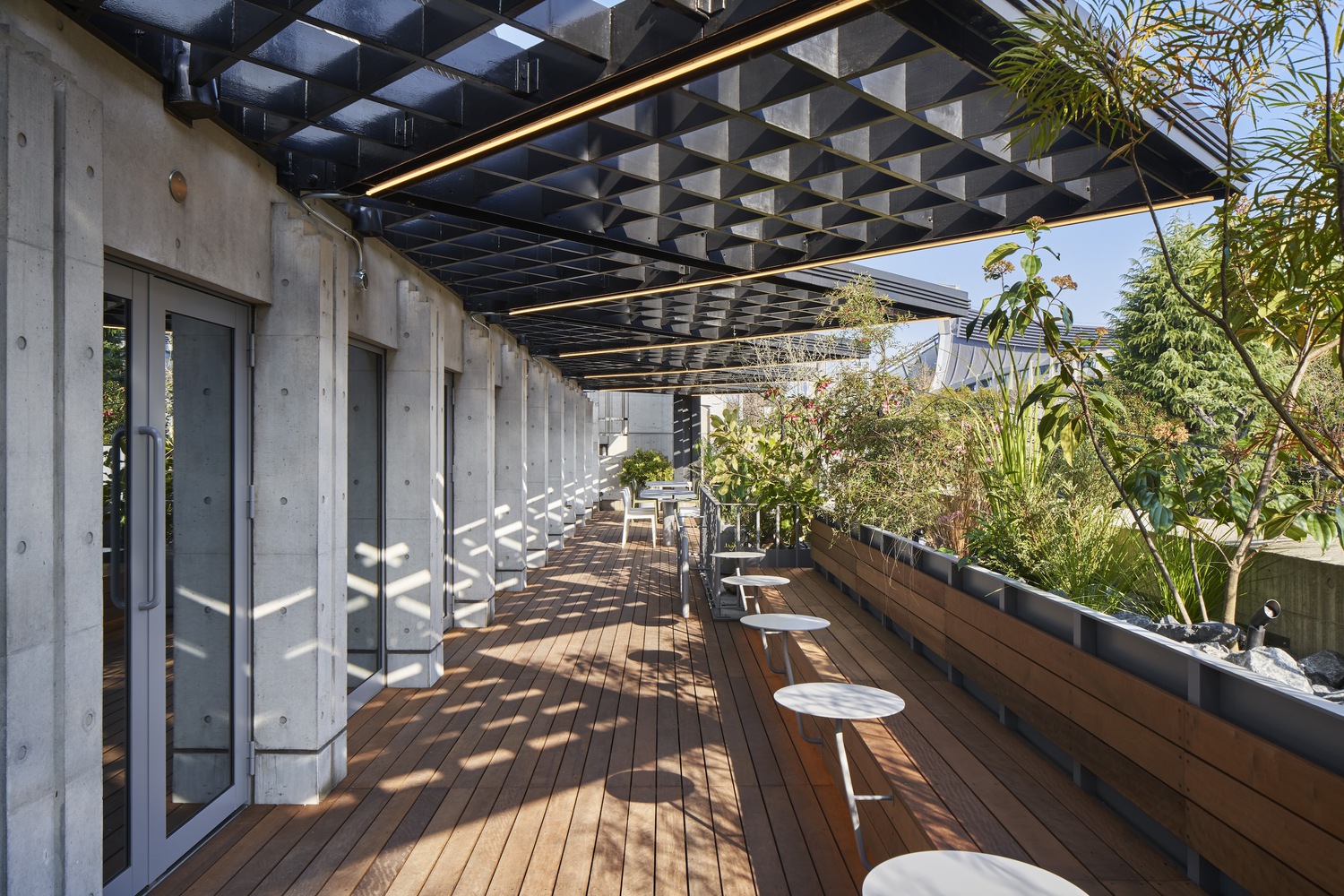
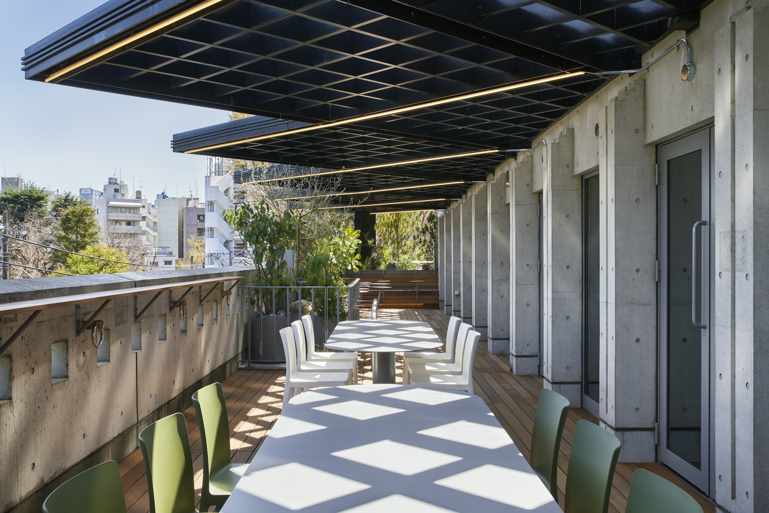
The first through third floors are planned to have a common space in the center, with event spaces, classrooms, and other functional spaces on both sides of the common space. The event space was designed to be a public and flexible space that connects the school with the outside world, and in consideration of visibility from the facade, it is bright and open and can be approached directly from the side of the entrance. The common space between the classrooms on the 2nd and 3rd floors is equipped with benches and high tables, which can be used for different purposes and serve as a space for students to connect with each other, making the time between classes more meaningful. More than half of the fourth floor is outdoors, with a view of the Yoyogi stadium and the lush greenery of Yoyogi Park, and a decked terrace with built-in benches, large tables, and counters. The building, built in the 1990s, is a post office building.
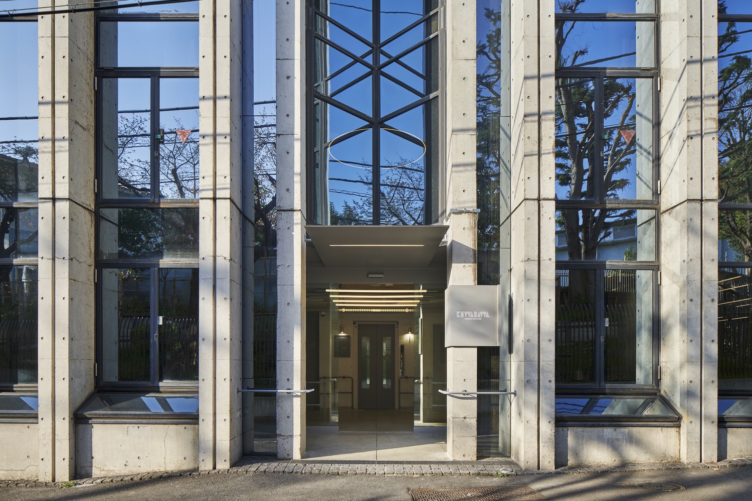
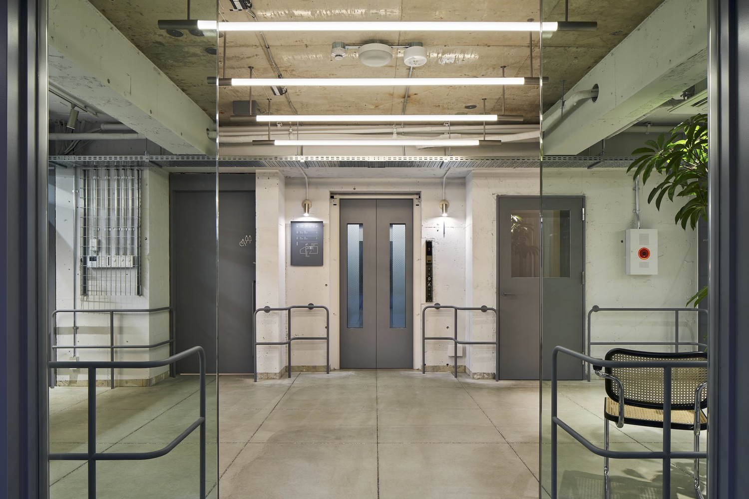
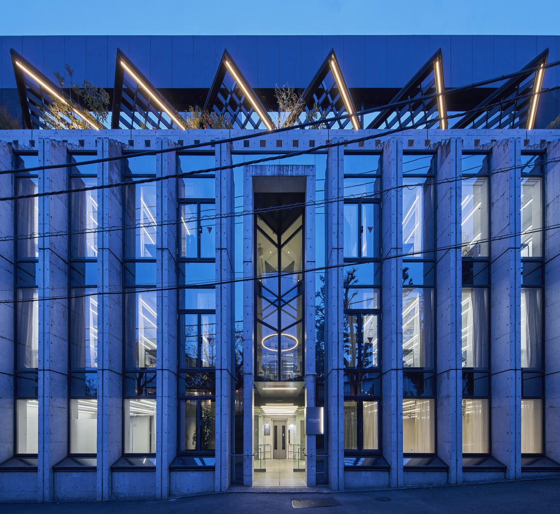
Built in the 1990s, the building has a distinctive concrete exterior that evokes a postmodern atmosphere, while the interior retains the old-fashioned interior of the time, with marble-clad walls and wooden floors. In order to contrast with the exterior, the interior was designed to be permanently neutral with an eye on the next few decades, with minimal decoration, and to add an urban edge to the building, which is located halfway between Shibuya and Harajuku. We were also conscious of the distribution of the budget, and as a whole, the space was designed to maximize the functionality of each room through minimal finishes and innovations, with many parts of the original structure exposed so that they can be updated as they are used.
Given the fact that the school was founded based on the design philosophy of the *Bauhaus in Germany, the interior materials are mainly steel, glass, and concrete, which pushed forward the progress of modernism, and the railings and sashes are modern updates of details used in Dessau. The new and old renovation, and the contrast between the Bauhaus of the time and Kuwasawa as a modern design school, are intended to create a contrast. The simple curled railings, custom-made curtains, fabrics, and upcycled marble tops soften the strength of the straight lines that emerge as the mechanisms and functions form the space in their bare form and give the space a human warmth that will be felt by the students as they use it daily. The space was also intended to evoke inspiration through direct contact with the hands and eyes of the students as they use it on a daily basis. The neutral gray (industrial gray without assertiveness) used in the white box painted on the skeleton is somewhat urban, but at the same time, it is moderate and is meant to accentuate the individual "colors" of the students as they pursue their designs.
The above elements will continue to create a universal impression that will serve as a balance for students studying in the city, allowing them to focus on their own studies, We hope that it will continue to function as a generous receptacle that carries on the history of the first design school in Japan.
Photography by Koji Fujii|TOREAL

from archdaily
