Konishi Gaffney Architects-Greyfriars Charteris Center
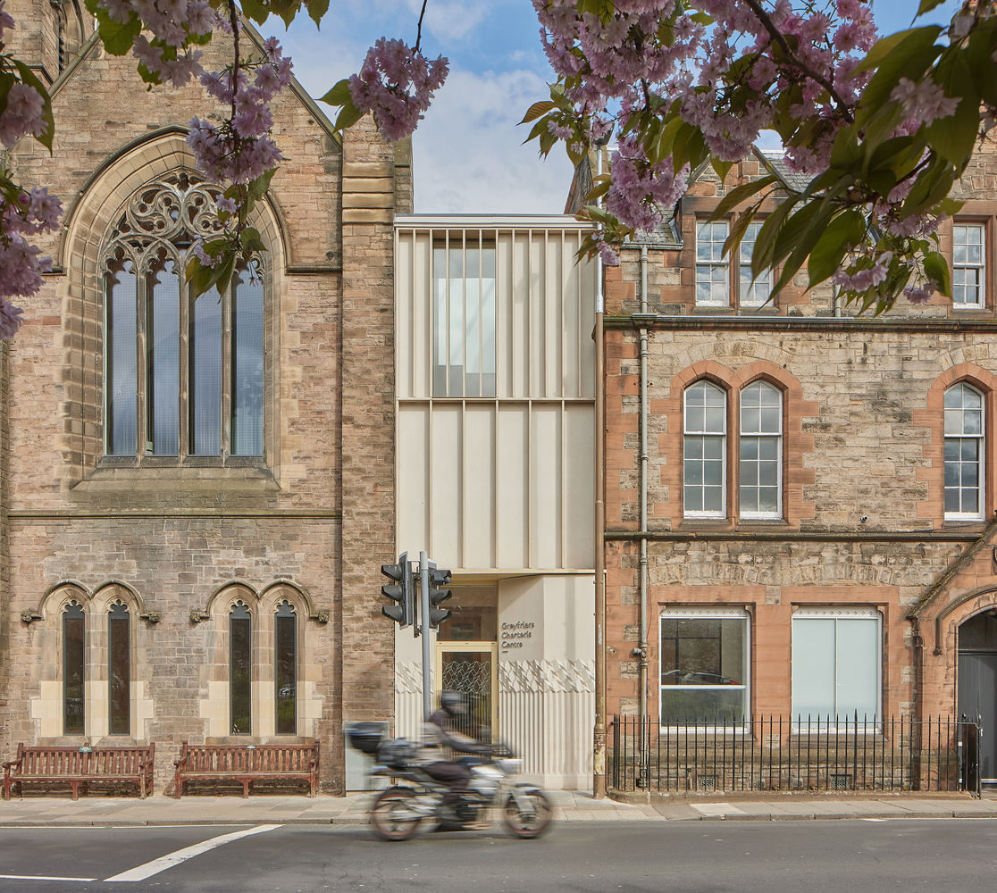
건물은 여러 층에 걸쳐 접근이 잘 되지 않아 폐쇄되어 거리에서 보이지 않았다. 디자인은 기존 건물의 부분 사이에 주 출입구를 재구성하여 외부적으로는 확실한 거리 존재감을 부여하고 내부적으로는 건물의 모든 부분이 현관 홀까지 수평 및 수직으로 시각적으로 개방되었다. 기존의 란셋 창을 없애고 공간을 시각적으로 열어 건물 내부를 투명하게 하여 통행인이 내부 활동을 볼 수 있도록 하여 참여를 유도했다. 새로운 계단과 좌석 공간이 형성되어 거리에서 건물을 통해 아래층으로 내려가는 전망을 만들고 코워킹 허브를 위의 커뮤니티 기능과 연결하는 역할을 했다.
Konishi Gaffney Architects have completed the overhaul of Greyfriars Charteris Centre in Edinburgh’s city center following an invited competition in 2017. The £1.7m refurbishment, improvement, and extension of the former church provides a flexible workspace, a community hub, events spaces, and a non-denominational sanctuary
The building suffered from poor access across multiple levels and was closed off, invisible from the street. The design reconfigured the main entrance which has been carefully slotted in between parts of the existing building giving it a definite street presence externally and, internally, all parts of the building are visually opened up to the entrance hall, both horizontally and vertically, welcoming the visitor in, get their bearings and move on through the building..
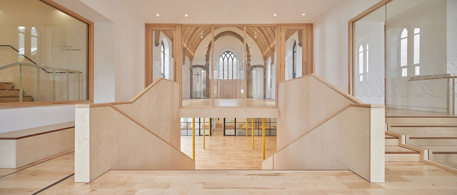
The existing lancet windows were cut down and the space visually opened up to allow transparency through the building so that passers-by can see activity inside which encourages participation. A new tiered staircase and seating area was formed that serves both to create views through the building from the street and down to the level below and to connect the coworking hub with the community functions above. Konishi Gaffney worked closely with local specialists Old School Fabrications from an early stage to develop simple but effective details for the staircase and a material palette of maple, walnut nosings, and birch-faced plywood finished with a whitewash to enhance its light appearance. This was used throughout the building for all new elements such that they are visually distinct yet compliment the fabric of the existing church buildings.
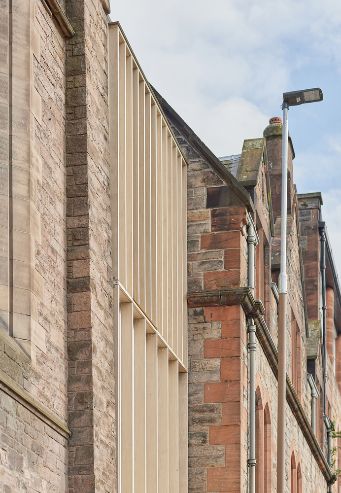
A timber ‘link’ building was inserted between the church and the neighboring office block forming a triple-height top-lit atrium with lift access to all levels. This was clad externally in white terrazzo panels with a sculptural relief pattern in collaboration with artist Steven Blench of Chalk Plaster. This was intended as a modern interpretation of the rusticated bases of the city’s Georgian buildings. The terrazzo panels are broken up at higher levels with a series of slender timber (Accoya) fins that give rhythm and order to the elevation.
Internally a restrained material pallet was used to characterize and unify the new joinery elements of the building: American maple, birch-faced plywood, and white plaster tied in with the pine ceiling of the main hall. The ceiling was stripped of its dark brown mahogany stain using a soda blasting technique which along with the careful lighting and new double glazing eloquently lightens the space. Dappled light filters through a 6m tall delicate maple screen that separates the hall from the new ‘all faiths and none sanctuary space above.
Along with the extensive use of timber in the project, significant improvements to the existing church building were made in terms of its environmental performance. This included the installation of loft and floor insulation and replacing the existing single-glazed pane windows with new double-glazed units including the large west-facing nave window. The original heating was replaced with an efficient system and low-energy LED lighting was fitted throughout. A 24kW solar array was installed on the building’s large south-facing roof, hidden from the street.
Photography Konishi Gaffeney Architects


from archdaily
