Magum architectes & urbanistes-Maine-eit-Loire Archives Storage Extension
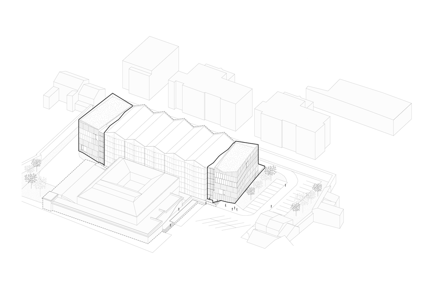
앙제시 중심부에 위치한 이 프로젝트는 밀폐된 도시 부지에 위치하며 기존 저장 시설 양쪽 끝에 두개의 보완적인 저장소가 추가로 구성된다. 증축된 부분은 주변 환경과의 조화를 이루면서 뚜렷한 존재감을 확립힌다. 기존 건물의 맥락을 고려하는 반면 증축된 부분의 물질성은 톱니 모양의 지붕선에서 영감을 받은 순수하고 우아한 입면을 드러낸다. 기존 건물의 미니멀한 재해석과 하늘을 향한 파사드의 다이내믹한 제스처를 통해 프로젝트의 감성을 엿볼 수 있다.
새로 추가된 첫 번째 부분은 모놀리식 특성이다. 그것의 팽팽한 선과 예리한 각도는 마커 역할을 하며 정문에서 계속 볼 수 있다. 원래 건물의 뒤쪽에 위치한 추가 부분의 두 번째 부분의 의도적으로 배경으로 물러나면서 유사한 건축적 언어를 채택한다.
Context. There are times when strong site constraints and the requirements of a rigorous program result in a singular piece of architecture. Set in the heart of the city of Angers, this project is sited on an enclosed urban plot and consists of two complementary additions, located on both ends of an existing storage facility.
Approach. The new additions to the Maine-et-Loire Archives establish a distinct presence while suggesting a respectful conversation with its surroundings. Its form considers its context while its materiality reveals pure and elegant facades inspired by the existing sawtooth rooflines. Through a minimalist reinterpretation of the existing building and the facade's dynamic gesture towards the sky, the project's sensitiveness can be observed.
The first part of the new addition is monolithic in character. Its taut lines and sharp angles act as a marker and remain visible from the main entrance. Located to the rear of the original building, the second part of the addition adopts a similar architectural language while deliberately receding into the background. [materiality] The building envelopes refined materiality and subtle variations that define the simplicity of the overall volume. Negative stripes on the facades occasionally give way to either flat or ridged surfaces, allowing for a play of light and shadow.
Some might see this as an abstract and minimalistic adornment while others could read this as a poetic metaphor for the variety of textures a book can offer. Around 150 precast concrete panels (approx. 1640 m²) were specifically tailored by a local specialist for this project. Aggregates were carefully selected and mixed to get the color as close as possible to the well-known local limestone found along the Loire Valley.
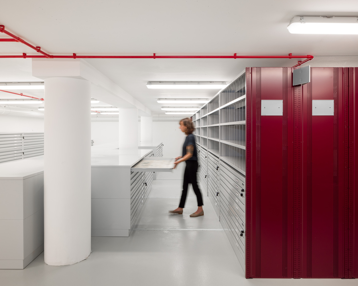
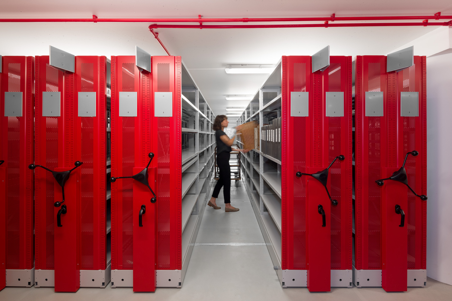
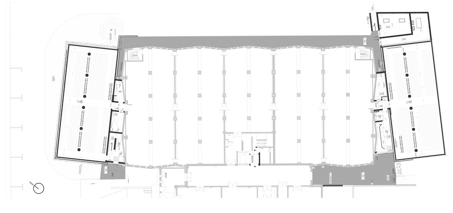
Interior. Storage spaces are in perpetual evolution. Archived paper records remain highly sensitive to UV radiation as well as thermal and hygrometrical variations. The three main concerns that drove the concept design were: The optimization of spaces and users' comfort level, stored paper documents‘ durability guarantee, and flexibility, and scalability of spaces. Answering those concerns, each addition now extends all six levels, following a rigorous and rational plan that maximizes storage linear meters and minimizes horizontal circulation.
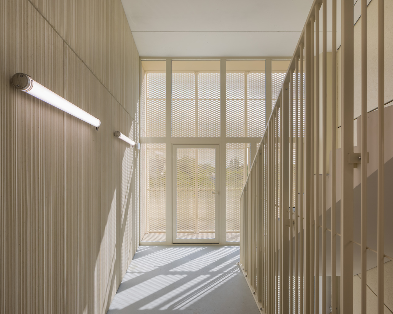
The vertical circulation was conceived to allow for potential future additions. They also simplify daily workflows and offer an abundance of natural light to all intermediate spaces. The use of precast panels was motivated by the need to guarantee a certain level of thermal insulation and efficiently control the building's hygrometry. The interior finishes remain raw and simple to indicate the building’s storage functions and technical capacity while allowing the archived paper documents to remain the focus of attention.
Photography by François Dantart


from archdaily
'Culture' 카테고리의 다른 글
| -나카노시마 미술관 [ Katsuhiko Endo Architect and Associates ] Nakanoshima Museum of Art Osaka (0) | 2022.12.16 |
|---|---|
| -ark38 리노베이션 [ Objekt Architecten + Hans Sterck ] ark38 Renovation (0) | 2022.12.08 |
| -쯔보 OCT 예술센터 [ Studio Zhu-Pei ] Zibo OCT Art Center (0) | 2022.11.29 |
| -그라운드 시소 서촌 [ Society of Architecture ] Brickwell Mixed Use Building (0) | 2022.11.25 |
| -지안상 스포츠 단지 [ CCDI ] Jianshang Sports Complex (0) | 2022.11.17 |
